When I stay in Las Vegas, I usually book the same hotel. I like this hotel. It’s just off the strip and has no casino. It’s more quiet and I like it that way.
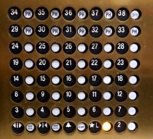
The elevator button panel though drives me nuts though. It takes too many brain cycles to select the right button. Here’s a photo of it:

If they would’ve added 1/2″ of spacing between the button and the number, it would make it a lot easier to select the right button. Now I’m standing in front of it and have to make a mental leap to look at the left to remind myself it’s the floor number first and then the button. If you’re on floor 10, that’s just annoying.
Often UX improvements aren’t big changes, but little convenience choices to reduce the mental load of making the correct choice or perform a certain task. The new password manager integration of IOS 12 is a great example of that.
Nobody gets it right
Conference calls
Marketeers’ relentness efforts for your attention
Notification spam
Sunday Morning Ritual
The new normal for generation Z
Virtual money